Whenever I get the opportunity to travel, I always make it a point to visit as many cultural landmarks as possible. Sure, I enjoy going to restaurants or exploring parks, but I prefer walking through a museum and being surprised as I turn every corner.
Typically, I don’t visit a museum’s website before attending for much more than an address or opening time, as I like the sense of discovery and surprise of knowing little beforehand. However, I usually deep-dive into the site once I get home. I like to use their sites to see if there is any additional information or details that I may have missed and reminisce about my previous visit.
Obviously, as someone who runs a company that builds websites for a series of arts organizations ourselves, I do have opinions on what makes for a great online experience. I have thoughts on what a good user experience is, how easy it is to discover the right information and how to connect emotionally by being presented with good stories. While museums rely on different solutions and strategies to connect with their audiences through social media, email, or digital advertising, their website is the most important spot for telling rich and engaging stories.
Our list of the Top 10 Museum Websites focuses on the best museums I’ve visited in the last 12 months. Each does a great job of serving their audience, sharing information, and generally offering a good look into what makes them special.
Top 10 Museum Websites
Canadian Museum for Human Rights (CMHR)
Winnipeg, MB
Established in 2008, the Canadian Museum for Human Rights (CMHR) was the first new national museum since 1967 and the first one located outside of Canada’s National Region. The aim of the museum is to explore the topic of human rights with a focus on, but not an exclusive view, of Canada. The museums want to increase an understanding of human rights and encourage respect for others through reflection and dialogue. The building that houses the CMHR is a very unique structure that adds a lot to the Winnipeg skyline.
The Stories section of the website does a great job at exploring a wide range of topics concerning human rights and offers some rich information around each, presenting multiple perspectives. Dealing with key historical events as well as modern perspectives and interviews, the CMHR manages to fulfill its mission while also dealing with an always evolving landscape.
Country Music Hall of Fame and Museum
Nashville, TN
During a summer trip last year to Kansas City, St. Louis, and Nashville, I had the opportunity to visit the National Blues Museum and American Jazz Museum. But it was the Country Music Hall of Fame and Museum and its website that caught my eye. The museum does a great job balancing the historical importance of country music while representing the present, popular artists. With just enough Taylor Swift content to make much of the Plank team happy, it easily appeals to a wide audience.
The Country Music Hall of Fame and Museum website does a really good job of offering a vast and varied online collection of artifacts, artwork, and exhibitions. It allows someone who can’t make it to the museum to get a real sense of the history of country music, its culture, and its place in United States history. The Hatch Show Print section of the museum is also well-represented and a key part of the online shopping experience.
Art Institute of Chicago
Chicago, IL
Undoubtedly one of my favourite places to visit in Chicago, the Art Institute of Chicago is simply massive. Founded in 1879, its main building is in a Beaux-Arts style, while its modern wing, which opened in 2009, houses its modern and contemporary art collection. With roughly 300,000 works of art in its collection, it focuses on Impressionist and Post-Impressionist paintings as well as American art.
The Art Institute of Chicago’s website mainly serves to inform visitors of the different options available to visit exhibits or events onsite. However, it also offers an online collection of thousands of artwork, writings, and resources. The online resources are a great compliment to the academic programs on offer by the School of the Art Institute of Chicago.
SFMOMA
San Francisco, CA
Established in 1935, the San Francisco Museum of Modern Art (SFMOMA) was the first museum in California to focus on contemporary and modern art. It’s a landmark building south of Market St. includes over 30,000 different artifacts, as well as a regular rotation of exhibitions and events.
While the SFMOMA website does a great job explaining the different sections of the museum and what you can discover, the Stories section offers some unique narratives and points of view that are rare among museum websites. The Art & Artists section of the website would, at first, seem like a traditional museum online, but the cross-referenced suggestions offer another layer of exploration.
National Museum of African American History and Culture
Washington, DC
As the newest addition to the Smithsonian Institution’s series of sites in the Washington, DC area, the National Museum of African American History and Culture (NMAAHC) houses a collection of almost 50,000 objects, exploring the rich history of African American culture. Honouring the community’s important place in United States history, it covers complex topics such as slavery as well as the advances made by the civil rights movement. Exploring African American contributions to politics, sports, arts and entertainment, the NMAAHC honours the key role in shaping American society.
The NMAAHC website does a great job at offering an online experience that complements an in-person visit, while also offering online collections like The Searchable Museum so that some key stories are told in unique ways. Offering learning tools like the North Star section of the website, the curious online visitor can have an experience that is different from but complements an in-person visit.
The British Museum
London, UK
Any visit to London wouldn’t be complete without a visit to The British Museum. With one of the most interesting collections in the world — although it’s worth questioning why some of which hasn’t been returned to the country of origin — one can explore an important part of human history. With the Great Court anchoring the different wings of the museum, one can move through the millions of objects easily. Founded in 1753, it’s one of the oldest and most famous museums in the world.
In addition to offering an extensive online look at its collections and exhibitions, I really appreciated how clear the information is in establishing the in-person experience, what’s available, and how to visit the museum. The Learn section of the site does a great job serving the different educational opportunities offered by the museum, regardless of youth or adult needs.
The Acropolis Museum
Athens, Greece
It was surreal to explore the Parthenon collection in collection, and then step on the actual Acropolis site and visit the accompanying Acropolis Museum. Opening in 2009, the Acropolis Museum contains over 4,000 artifacts from Greece’s Bronze and Byzantine Ages. The collection on display includes items from the Acropolis site, with the aim of displaying the archaeological history of the site.
The Acropolis Museum website has a vast online collection that lets users explore the various objects on display at the museum and get a more detailed view of each item. The Research and Conservation section of the website offers a good look into the efforts of the museum team to protect and preserve the Acropolis artifacts. Hopefully one day, the volume of items in the collection will grow through repatriation efforts.
Philadelphia Museum of Art
Philadelphia, PA
While the Philadelphia Museum of Art is worthy of a visit, given its collection of American, Asian, and European art, most people will want to relive that key moment from the film “Rocky” and race up its steps. Opened to the public in the late 1920s, it’s one of the largest museums in the United States.
The Philadelphia Museum of Art’s website does a great job of showing what’s currently happening and what’s on display. It also offers users the ability to explore an online collection of over 170,000 objects and learn in more detail about each item. The educational resources are also top notch and offer a lot for educators to use with their students.
The Metropolitan Museum of Art
New York City, NY
The Metropolitan Museum of Art (Met) is one of the world’s largest and most beloved museums. With millions of visitors annually, it is one of New York City’s key landmarks at the eastern edge of Central Park. The Met consists of two sites: The Met Fifth Avenue, which focuses on contemporary art, and The Met Cloisters, which showcases medieval European art and architecture.
The Met website is a great example of how to create a look and feel that represents the feeling of an in-person visit. With great photography and well-framed spots inside and outside of the museum, you get a great sense of what it would be like to experience the Met. The online store is easy to navigate and boasts a really interesting collection of things to buy. Unlike a lot of kitschy museum stores, there is a well-curated selection of items for purchase.
Canadian Museum of History
Gatineau, QC
Located in Gatineau, QC, right across the river from Ottawa, ON, the Canadian Museum of History is one of Canada’s biggest and most famous museums. Founded in 1856 as the Museum of the Geological Survey of Canada, it aims to explore Canada’s stories from a cultural and historical perspective. The museum’s Grand Hall offers a great view of Parliament Hill, and the First Peoples Hall honours the achievements of our Indigenous peoples.
The current website — which is presently undergoing a redesign — does a good job sharing what’s going on at the museum and clearly explains all of the different things currently happening there. While the collection and learning materials on the website are solid, what stands out are its online exhibitions, which explore a lot of unique topics that are relevant parts of the Canadian historical experience.
Final Thoughts
With over 50,00 museums worldwide, deciding which ones have great, useful and interesting websites will obviously be subjective. Since most museum websites also generally have the same features, the key to being a noteworthy and top-quality online resource is to offer something unique, get across what is special about the organization, and connect emotionally with site visitors. Given that I’ve had the opportunity to visit some world-class museums over the past year, it has been easy to pick 10 top-quality websites to showcase.
If you have some favourite museums that you think we should add to this list or future posts, we’d love to hear from you.
In 2024, a new era ushers in an even more exciting digital landscape than ever before. New technologies and trends shape the way that we create websites and consider web design moving forward.
We don’t encourage anyone to run and jump onto the latest trends every year. But keeping a finger on the pulse of what is considered a must-have for a modern website is a great way to ensure that your website is up-to-date, inclusive, and visually appealing to your clients and users.
From increased awareness of accessibility to infusing fun into functionality, here are some of the top considerations to keep in mind when designing a website in 2024.
Sustainable Web Design
What Makes Web Design Sustainable?
Environmental sustainability, as it applies to the digital world, is a fairly new topic. Until recently, sustainability was only of concern in relation to topics such as social issues. However, it is just as important — if not more important — to consider how digital products and services impact the environment.
As a result, sustainable web design is an approach that puts our planet at the forefront of web development. While creating functional, visually stunning websites is important, we must also take into consideration how we can limit our burden on the environment.
How To Practice Sustainable Web Design
When we picture the digital landscape, we can imagine it like a globe, a series or interconnected countries passing information between them. If the internet were a country, it would be the 7th largest polluter in the world. Not exactly the outcome we imagined or the one that we hoped for.
The digital world is vast and extensive. But how can we ensure that it doesn’t overburden our actual planet?
For starters, we must ensure that the resources stored online don’t take up too much cyberspace. By minimizing files, such as images, we can reduce bandwidth and server overload. Where appropriate, it is best to use grayscale and monochrome images to lighten our carbon footprint.
Did you know that approximately 3.7% of global greenhouse gas emissions are generated by digital technologies? It might seem like an overwhelming reality. But small measures can make a big difference. In 2020, Dutch programmer Danny Van Kooten trimmed the code of his popular WordPress plug-in for Mailchimp. Over 2 million websites utilize the plug-in. As a result of this decision, our global CO2 output was reduced by nearly 60,000 kilograms.
Accessibility-Focused Design
Web Accessibility: Essential For Some, Useful For All
Accessibility in web design is not a trend, but a necessity. Currently, 90% of websites are inaccessible to those who rely on assistive devices. As more awareness is brought to the importance of accessibility, it plays a more significant role in web design.
More and more, websites are being built with accessibility in mind. This is largely due to the continued efforts of the W3C Web Accessibility Initiative (WAI). The members of this initiative are responsible for publishing the Web Content Accessibility Guidelines (WCAG).
In order to meet these guidelines, the following conditions must be met:
- Perceivable: Users can perceive the information and user interface with their available senses.
- Operable: A website is not only accessible by a mouse, but a keyboard or other assistive device.
- Understandable: The user experience is created to be understandable by the broadest possible audience.
- Robust: The website is tested to ensure that content is compatible with multiple browsers, assistive technologies, and other user agents.
Implementing Accessibility in Web Design
Recently, there has been an increase in the implementation of accessibility in web design — but it still only scratches the surface of what can and must be done. The good news is that it isn’t difficult to start making your website more inclusive to all users.
Alternative text is an easy and immediate way to improve accessibility. It can be applied to anything from images and video to audio content. Alternative text describes content to individuals with visual impairments who utilize assistive devices such as screen readers. Even outside of the web design world, image alternative text is increasingly common in spaces such as social media platforms. By adopting these standards, visual content is instantly more accessible to users.
It’s also crucial to consider how your website might be negatively impacting users, in addition to impeding access. For instance, according to W3C guidelines, accessible web pages must not contain anything that flashes more than three times in any one second period. This type of content should be avoided when possible and a warning is essential when flashing is present.
Animated Illustrations
Animation Meets Website Design
Animations have become a fun opportunity for designers to explore new and visually stunning ways to convey information and enhance the user experience. They provide an outlet for creativity and brand personality as a way to infuse the identity of an organization in exciting and distinctive ways.
Animations aren’t only visually impressive; in fact, they can be a big sell for your website. Animated content, as well as videos, can increase conversions on your landing page by over 80%. So you might be wondering, how exactly can animations be implemented in modern web design?
An Immersive Web Experience
Boring loading pages? We don’t know them! Progression animations are often used to improve the user experience during the loading process. An animated progress bar can create a visually appealing way for the user to pass the time. Furthermore, scroll animation can be a great way to add depth to your website by guiding users through content in a dynamic way.
Animations can also be used on a broader scale to enhance a website’s storytelling capabilities. User engagement increases when you present a story with your products or services, particularly when animations are present. A long piece of written content can be broken down into a more digestible and immersive experience that users can connect with.
But don’t forget about your accessibility standards! When creating animations for the web, it’s important to stick to those guidelines we discussed above to ensure that you are providing the best possible experience for your audience.
404 Rehabilitation
404 Error Pages
Speaking of visually impressive web content, let’s put the “fun” back in “fundamentals”! Increasingly, web designers are turning to more creative options when it comes to developing their 404 error pages.
A 404 error page is a standard HTTP error message code that indicates the website you are attempting to reach cannot be located on the server. There are a few reasons why a user might encounter this error, such as a relocated web page, a caching error, a problem with DNS, or even something as simple as the incorrect URL being typed in.
Fun in Failure: Bringing the 404 Back to Life
404 error pages might not be the utmost concern to designer and client alike. In fact, at first glance, they are often written off as only mechanical and functional. But you might be surprised to learn that error pages are a great avenue for creative expression.
Take Plank’s 404 error page, for instance. Not only does it display the typical error code with a redirect to our work page, but it utilizes animations and interactive elements to engage users who reach the page. You can spend a few minutes exploring our error page at the link above to learn more (it’s okay if you get distracted by playing with the features, we won’t judge you).
Top Web Design Must-Haves for 2024
2024 is an exciting year for web design. As the world changes, so too does our digital world and it’s important to keep these considerations in mind when developing a website. While your website doesn’t need to be the most “trendy” page on the internet — in fact, we discourage it — these must-haves will help you to create the best and most inclusive possible website for your audience.
Hello there! You might notice that things look different around here. For the past year, we have undergone a complete rebranding process including everything from our logo to our website. And we’re so excited to finally introduce it all to you.
For us, a rebrand meant not just a visual change but also a desire to best represent who we are as a company. Over the past (almost) 25 years, Plank’s website and branding have grown and evolved a multitude of times and we knew it was time for another overhaul.
Our Promise
One of the things that inspired our rebrand was looking at our promise to our clients, people, and community as a whole. In the past three years, we have started exciting initiatives including our Mentorship Program and Ethical Web Design Framework, and we also became a Certified B Corporation! All in all, this led us on the journey to better embody our values, initiatives and people.
We use our business as a force for good by inspiring purpose-driven organizations to join us in making the internet a better space for all.
How do we do it
We bring out the best in our people and partners, by collaboratively building meaningful websites that meet the five pillars of our Ethical Web Design Framework: Accessibility & Inclusion, Privacy & Security, Device-First Design, Development Best Practices & Sustainability, and Environmental Considerations.
We connect artists to their audiences, citizens to their communities, and information seekers with the answers they need.
To ensure our digital presence was aligned with our mission, we committed to:
- Brand identity workshops
- A brand refresh
- A website redesign
Now let’s look at how it all came together.
Brand Identity
Redefining our brand identity, starting with activities defining our personality, voice, and tone. We held a series of Plank Hack Day Activities where we reviewed our values, client personas, client quotes, and our mission statement to help us describe Plank with five characteristics.
Why Five Characteristics?
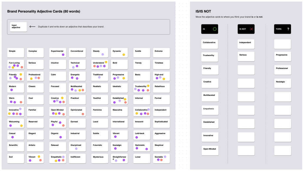
In our quest to define who we are, before even beginning the brainstorming of colours and logos, we decided to define Plank using five characteristics to get across the core of Plank accurately. We asked ourselves if Plank were a person how would our community describe them?
Using these characteristics, we could better guide the branding process, understand how we connect with our clients and partners and develop our brand voice and tone.
Who is Plank?
At our core, we build connections through our desire to help and support others. Plank’s story began with one desire: to make the web a better place. We do this by being champions of empathy, compassion, support and trust.
We provide our clients with the needed stability when starting a digital project. We are the partners that provide our expertise while listening to their needs. We let our collaborative and caring spirit guide us in everything that we do.
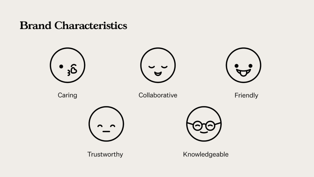
We are:
- Caring – We put our clients & partners at the centre of everything we do. We are committed to solving meaningful problems and making the web a better place.
- Collaborative – We’re active listeners and open-minded. We give our expertise while respecting client needs and opinions.
- Friendly – We’re warm, approachable, and most importantly human.
- Trustworthy – We provide the highest quality work and keep clients updated along the way. If issues arise, we address them head-on.
- Knowledgeable – We’re established experts in web design with over 20 years of experience. We’re successful because of our willingness to learn and innovate.
With these five words as our guide, we jumped into our brand refresh.
Brand Refresh
For our brand refresh, we collaborated with the wonderful Ray Dak Lam, a talented illustrator and graphic designer from Edmonton, Canada. He designed our logo and brand assets and helped us choose our typefaces and a fresh colour palette.
Our Colours
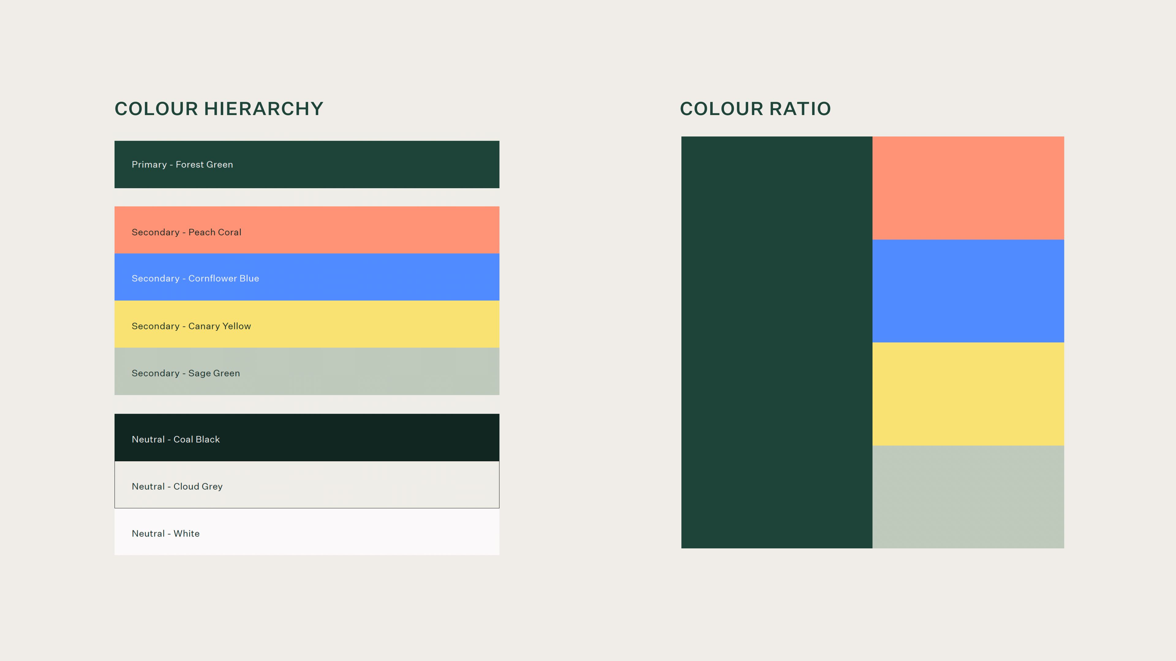
An overall warm, friendly palette, our colours convey balance, compassion, and trust while still being vibrant and fresh.
Our forest green perfectly represents our overall identity as welcoming and trustworthy while paying homage to the natural, organic incarnations of Plank’s previous branding with its prominent leaf and wood elements.
Our secondary palette adds a modern, vibrant, and friendly look and feel, with its warm yellow, zesty coral, and invigorating blue. As a digital agency, these bright colours connect with our community of arts and culture, mission-driven people.
Our neutral colours convey Plank’s balanced, grounded nature underlying all of our core characteristics.
Our Typography
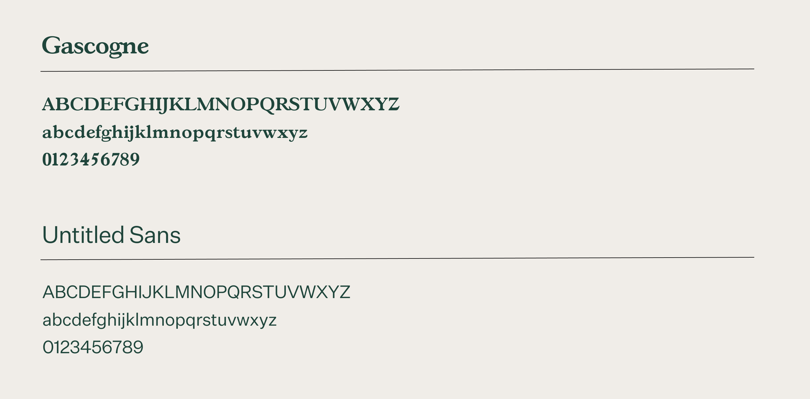
Ray selected Gascogne to serve as our display typeface. It is a rounded serif that feels friendly and approachable while still remaining sophisticated. It is a humanist typeface with forms that reference the stroke of a pen, extending the organic hand-drawn nature of our shapes.
The choice of Untitled Sans typeface for our body text serves as a more neutral sans serif that beautifully compliments the humanist Gascogne with its modern digital feel.
Our Logo
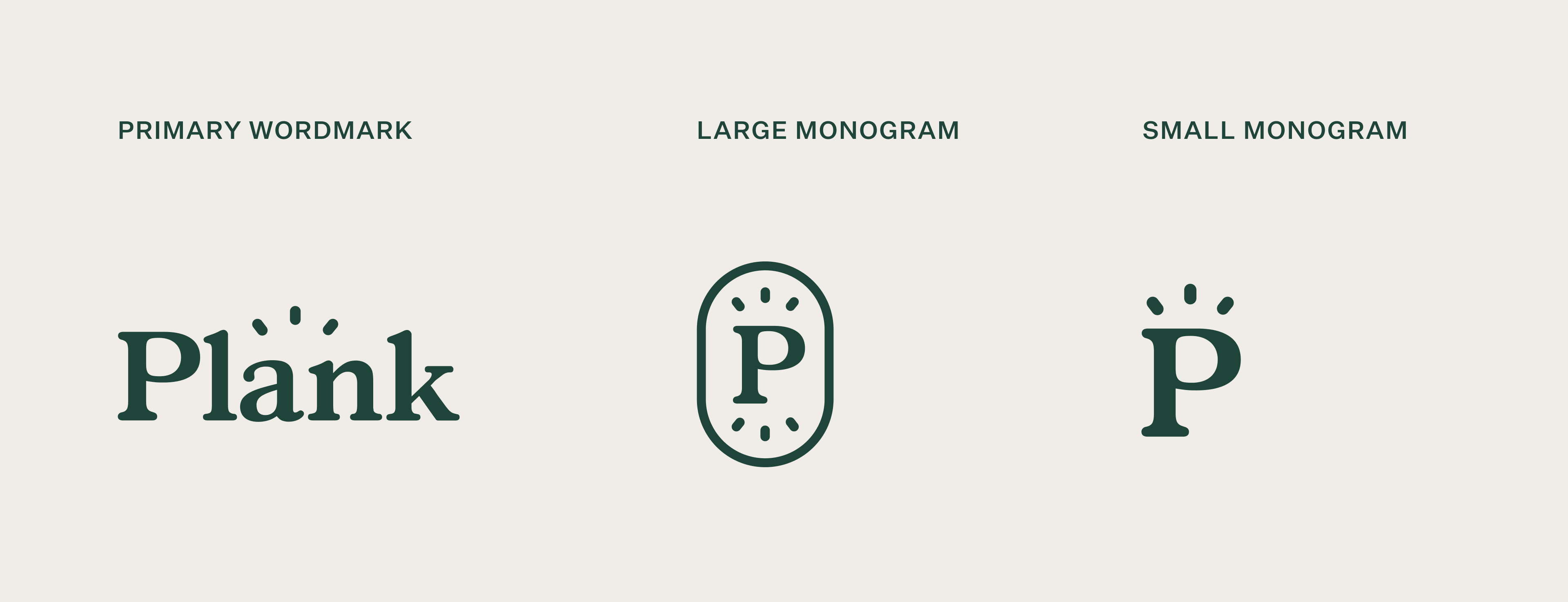
We are in love with our new logo! Ray did a wonderful job of capturing Plank’s personality with bold yet soft qualities. The accent lines above the wordmark evoke our friendly bright nature, vast knowledge, and innovative spirit all at once.
Our Graphic Elements
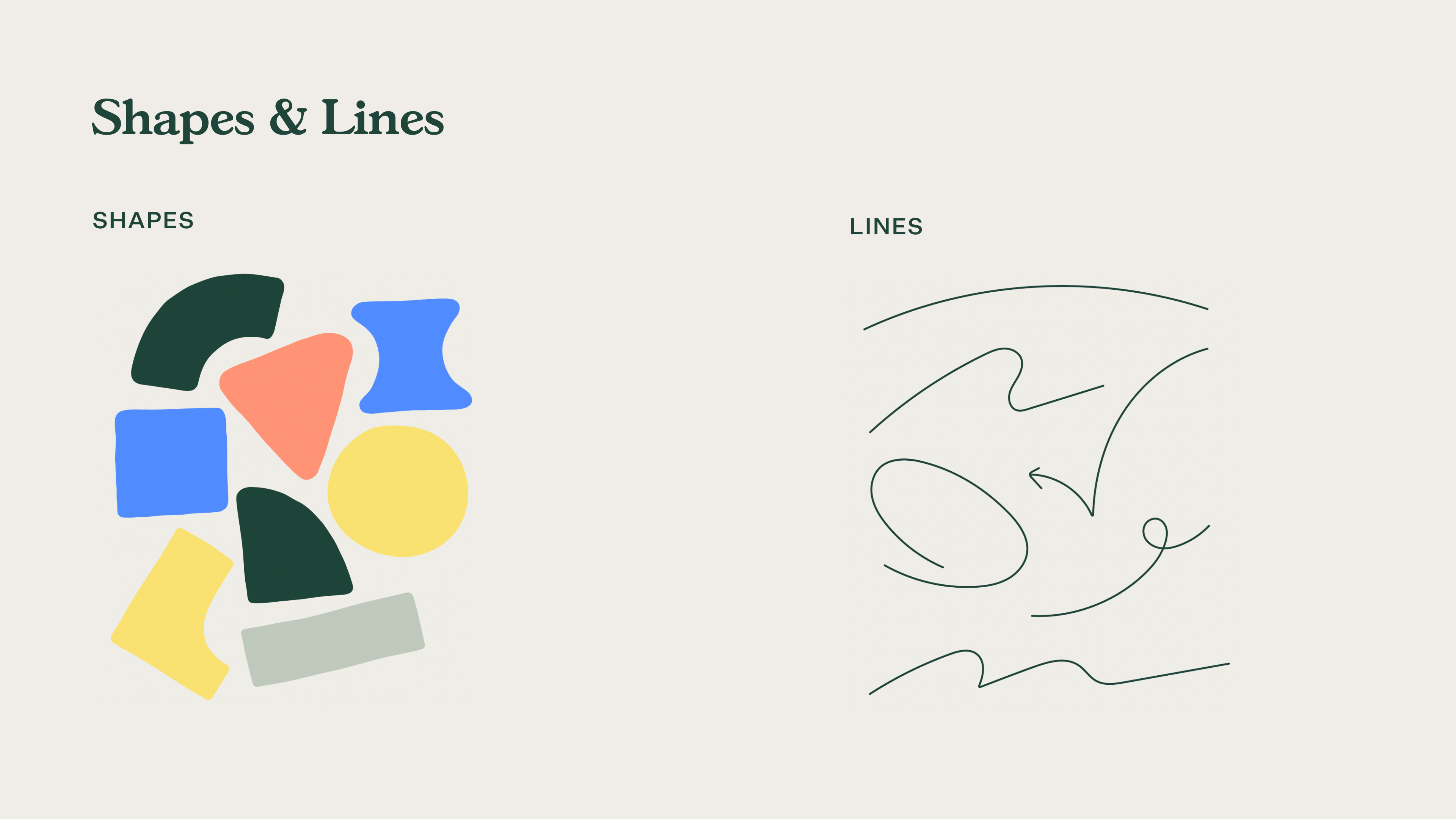
Our graphic elements are an important aspect of how we showcase our energetic and human-centred approach to business. We wanted to make sure these elements could serve as a flexible component system that we could adapt independently and in a variety of ways.
The result is a combination of organic, hand-drawn shapes and dynamic lines that breathe life and personality into our brand.
Website Redesign
Once we established our new brand, the long yet exciting process of making it our own began.
Our main goals with our website were to better showcase our expertise, our team, our initiatives, and our mission.
Animations & Transitions
Giving life to our brand and creating movement throughout our site, we featured a variety of animated buttons, seamless page transitions, and fun animations.
Our creative and frontend teams worked extremely hard to make it all happen and we are super proud of the result.
Culture Page
Our previous About page didn’t quite capture all the wonderful initiatives, people, and culture at Plank. We wanted a dedicated page to showcase all the things that we do behind the scenes.
Expertise Page
With over 20 years of experience in web design, we wanted a page to illustrate our vast knowledge as well as how we support our clients. With our Hack Days, Ethical Web Design Framework, and various service offerings, we have a lot to show off!
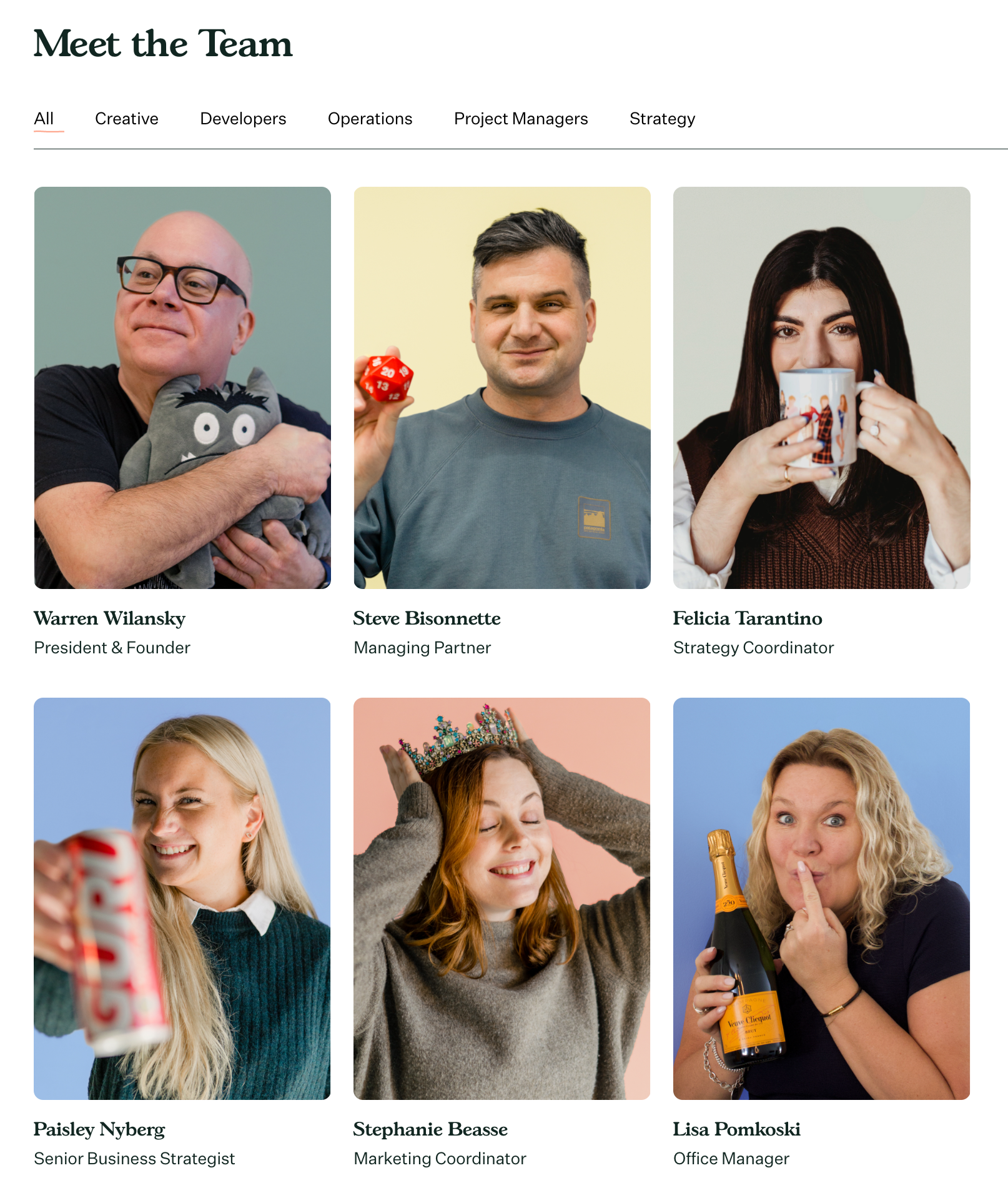
Our People
Our dedicated team is the powerhouse behind Plank! With a lively team, we wanted to showcase them and their unique dispositions.
We hope you enjoy our new website and branding! If you’d like to know more about our process please reach out.
When starting a digital project, thinking about how it will look visually can be one of the most exciting parts. It can also be one of the most daunting and intimidating. There are so many directions you can take and you might not know where to start. With careful planning, you can give your web designers the proper guidance to create a platform you love.
While the visual elements are an important component, the key to a beautifully designed project is actually your art direction. Art direction is a combination of your strategic goals, target audience, and user experience which are then translated into a design concept. With a strong art direction, you can create a unique experience that engages your audience and builds long-lasting connections.
Design vs. Art Direction
The first thing we should establish is the difference between design and art direction and how to incorporate both ways of thinking into your project.
- Design is how it looks. It focuses on UX principles like colour contrast, visual hierarchy, and whitespace.
- Art direction focuses on how it feels. It questions if your colour palette fits your brand image, what feelings your typography portrays, and if your storytelling is engaging users.
Designers need your help establishing a direction because it will ultimately be informed by the “why” of your project. The better you understand the focus and who you are speaking to, the easier it will be for them to create something you are proud of.
Design is the how. It’s the foundation of all communication, the process and production of typography, color, scale, and placement. Art direction is the why. It’s the concept and decisions that wrap itself around the entire product.
Jarrod Riddle, Sr. Art Director, Big Spaceship
Helping your designers choose an art direction is fundamental to the success of your digital project. But how do you properly direct them? What kind of questions should you prepare for? Where do you even start?
7 Ways to Guide Your Project’s Art Direction
1. Practice good communication
Having consistent and open communication with your designer can avoid hiccups throughout your digital project. Don’t be afraid of letting them know of any struggles you’re facing no matter how big or small. The best projects are created when there is open communication between client and agency. You know your users and organization best, and the more information you share the better they can cater to your needs.
2. Set your focus
Setting your focus is what will guide you throughout the process. Before looking into the design of your project it’s important to understand what you want to accomplish. The best way to start is by defining your organizational goals. What will be the main function of your platform? Who are you targeting?
Although you might have multiple goals and different types of users, it’s important to prioritize them. Defining your primary, secondary, and tertiary goals will help guide both you and the designer. A primary goal can be selling tickets, while a secondary goal can be receiving donations. No matter what your goals are, it’s important to distinguish their order of importance.
To help you define your goals, take the time to get into the mind of the people you want to reach. A great exercise to help you do that is creating user personas.
3. Create user personas
Creating user personas is a great way to understand the main people you serve. It’s crucial to know your audience because it will heavily influence what your site looks like. A platform will look completely different if it’s designed for a young Millennial working in musical theatre compared to a Gen X working as a university professor. They will have different goals, challenges, and characteristics.
To get a better sense of your audience, you might want to talk to multiple people in your organization about your clients. Don’t be afraid to dig deep. The more information you can discover about your users, the more designers can cater to them.
It’s important to remember that you can’t appeal to everyone. Some digital experiences can cater to a larger variety of people like music festivals or media outlets. But it’s a good practice to analyze who your biggest target market is. This allows you to stand out from your competitors and define your brand personality.
4. Know your brand image and identity
Once you’ve determined your target audience and project focus, you can evaluate if your brand properly aligns with them. Your brand colours, imagery, typography, and voice should speak to your audience and reflect your goals.
A large part of the designer’s job will be to create a concept that fits your project focus, users, and brand image. If you don’t have a pre-established brand, they can work with you to develop a brand identity that fits your organization.
Just remember that your brand is what gives your project its emotional appeal and defines how you connect with your users. It influences how you speak to your users and how you tell your story. This brings us to our next point: content.
5. Know your site and its content
Content is the backbone of any digital project. While the web is extremely fluid compared to other art forms like print, your content needs to be decided beforehand as it will influence your design layout.
Designers will take inventory of all the information you want to convey to your users and then create a layout that supports it. Adding content or pages later on in the process will require additional time to incorporate into your concept.
Make sure you have a plan for your content before beginning the web design process. Taking stock of your content and having a rough idea of what you want to keep, reorganize, or remove can be a huge time-saver for designers in the long run.
Remember, if you need guidance or advice on your site’s content, your designers are there to help you! They are experts in user experience and know how to write engaging copy that guides your users across your platform.
6. Trust your experts
Designers, developers, and project managers want to help you achieve your goals. They also have a vast amount of knowledge regarding digital spaces, user experience, user interfaces, and content management systems. Creating a successful project requires a lot of teamwork on both sides to understand the user and their needs. Don’t be afraid to listen to your agency’s advice.
Developing trust between agency and client can take some time, but properly reviewing the agency you choose to work with can be a good way to develop trust early on. Look for agencies that specialize in your target market. If they have done similar projects in the past, they’ll most likely already have a good understanding of your needs. Beyond their work experience and portfolio, their company values can also be a good indication of brand alignment.
7. Keep an open mind
Keeping an open mind throughout the process will help you to make the best decisions for your users. It’s easy to get stuck on a visual element or the latest web design trends. Just remember that these trends might not support your overall concept.
If you ever find yourself getting stuck, think back to your organizational goals and your users’ needs. Focusing on the bigger picture will allow you to make informed decisions no matter what complexities you face.
We also recommend keeping your decision-making circle small. Remember that design preference is subjective. If you start asking too many people what they think, you might find it harder to make the right call. Decide beforehand who you will include in the process and who will make the final decision.
Helping web designers establish your art direction
Art direction is more than how your project looks. It’s the why, who and how. If you take the time to understand how all these parts work together you can create a digital experience that speaks directly to your users.
Keeping all these tips in mind, alongside your digital agency, you can establish a unique art direction that takes into account your organizational goals, your target audience, and your brand identity.
A lot goes into building a website! It can be overwhelming to keep track of everything, especially if it’s your first time overseeing a website redesign.
One thing to keep in mind is that your website is more than just your organisation’s visuals. A visually pleasing website is important of course, but branding standards aren’t the only thing that will shape your site. You also need to think about the navigation, the behind-the-scenes coding, as well as your overall business goals, in order to be successful.
Below, we’ve outlined some of the key web design considerations for an appealing and functional website. Whether you’re building a website yourself using pre-built templates or working with a web design agency, these are some of the basic practices that you should be aware of before starting a redesign.
- Branding Standards – the design elements that define your brand and attract your target audience.
- Navigation Standards – the principles that affect how users navigate your site and improve your users experience.
- Coding Standards – the standards that ensure your website runs smoothly and efficiently on all devices.
1. Branding Standards
This is where the importance of visuals comes into play for your website. You want your website to represent your brand and remain consistent. There are a lot of elements that go into the branding of your website, even the voice and tone of your content need to flow across your site.
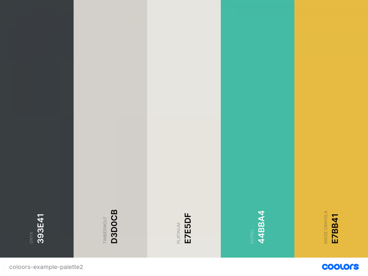
Colour Palette
Your colour palette will be a quintessential part of your design. Having a consistent palette is the easiest way to build your brand’s recognition. Not only that, colours can convey different emotions, align with different age groups, and represent different time periods.
Your brand colours should be based on:
- your target audience &
- how you want to be perceived.
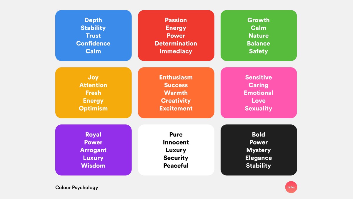
Generally, banks and tech companies will implement blue colours to convey trust, loyalty and stability. Think BMO, Dell, or Facebook. Bolder colours like red convey emotions of passion, power, and excitement. Think YouTube, Red Bull, or Virgin Mobile.
There are endless colour combinations you could develop, but choosing a maximum of 3 colours is the standard. Some brands will go with a complementary colour or two. Others like Youtube only have one primary colour along with shades of black and white. We usually recommend using at least one contrasting and one harmonious colour to build your brand.
Primary Colour – You’ll want to pick your main colour, the one that truly represents your brand. If you already have an established brand, you most likely already have a primary brand colour. When it comes to the web, your primary colour might have to be adapted slightly to be fit for a screen. For example, bold colours that work well on print materials might be too harsh for a screen, causing discomfort for your users.
Contrasting Colour – A contrasting colour will make design elements such as icons, buttons, and illustrations stand out. It’s also necessary when complying with accessibility standards. Those with visual impairments need a certain level of contrast to perceive your text and images. This includes all parts of your website like your menu, headers, and footers.
The Coolors free Color Contrast Checker is a great option to see if your colours comply with the Web Content Accessibility Guidelines (WCAG).
Harmonious Colour – Another colour you should include is a harmonious colour. Normally this means that it sits either next to or very close to your primary colour on the colour wheel. A popular colour palette includes analogous colours, which are three colours that are side by side on the colour wheel. These types of colour combinations are great for icons, illustrations, or infographics as they are super appealing to the eye.
If you want to visualise your perfect colour palette try using Coolors, an amazing free tool you can use for inspiration and palette creation.
Typography
Your website fonts are another key part of your branding. Now that digital marketing is a must in every company’s marketing strategy, typography plays an important role in building your online brand.
Different types of typefaces will shape how individuals see your brand. Here’s a breakdown of the main font types.
Serif – these fonts contain serifs, which are small strokes added onto a character. This typeface is usually described as elegant, authoritative, trustworthy and traditional.
Some of our favourites:
- Garamond
- Playfair Display
- Merriweather
Sans-serif – these fonts do not contain serifs, hence the name. This typeface is seen as modern, friendly, and youthful.
Some of our favourites:
- Apercu
- Montserrat
- Avenir Next
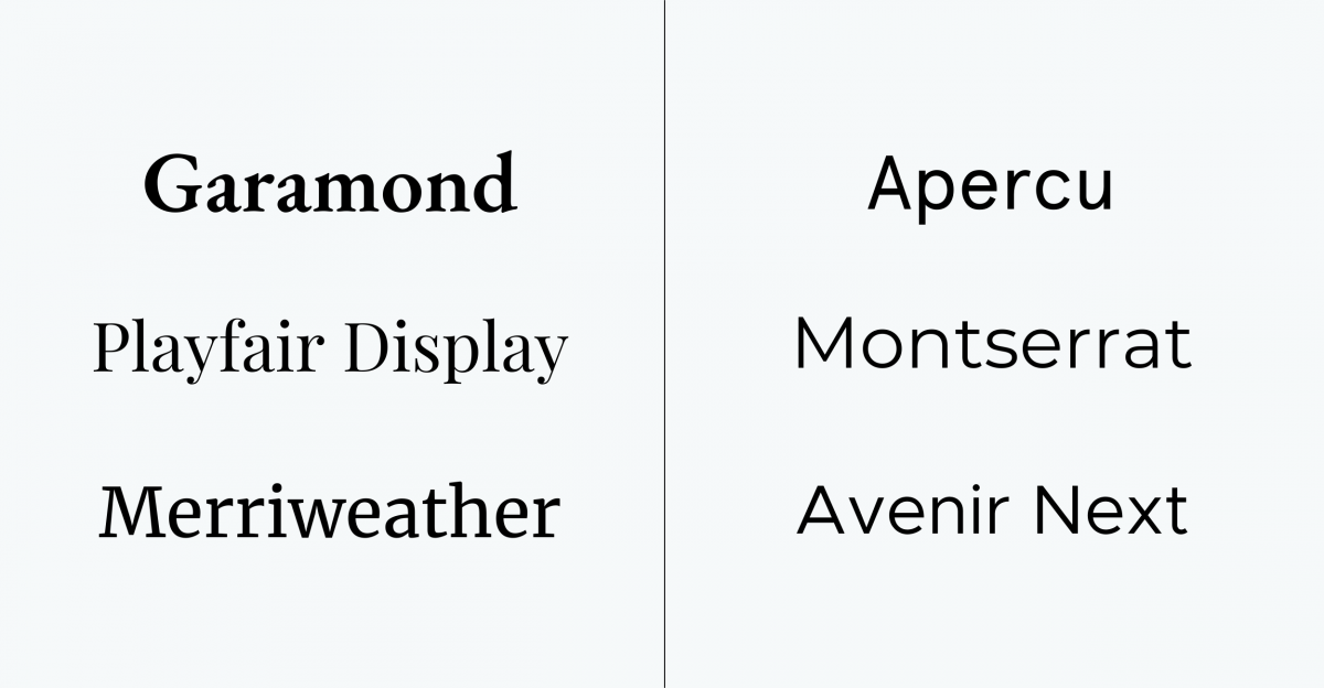
Script – also known as cursive, these fonts look like cursive handwriting. This font is best used as a title.
Display – the quirky sibling of the group, these fonts have no discernible similarities as they come in many different shapes and styles. They are mostly inspired by calligraphy and are best used in titles.
For script and display fonts, we usually avoid them even for titles, because they’ll look great on desktop when they’re big, but might cause legibility issues when they’re displayed on a smaller screen on mobile.
When you are choosing your font, you have to remember that it represents your brand. If you’re selling a lifestyle product to Millennials or Gen Z then you should consider using a sans-serif font. If you’re trying to appear trustworthy, professional or elegant perhaps a serif font is more appropriate.
Brands like Google and Apple exclusively use sans serif. Their brands are both seen as modern, youthful, and fresh.
While brands like Dior and Armani use serif fonts for their logo and headings to convey elegance and class.
Design Elements
Design elements are an aspect of web design that goes through never-ending waves of fads and trends. But it’s also where you can be your most creative!
The design elements of your website are what add depth and personality to your site. Think illustrations, animations, photos, and icons. You need to choose and develop your website’s style along with your brand. Is your site playful? Is it more serious? Every company has a brand personality and the design elements you choose will play a very important role in properly conveying it.
Since design trends are always changing and evolving, let’s go over some of the different types of elements you can incorporate into your website.
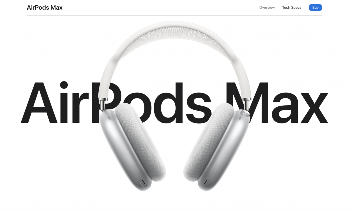
Animations – the poster child for trendy websites! Animations are extremely impressive and for a good reason. They have an interactive element that catches the user’s attention and leaves them with a lasting impression, but only if it’s done well. The animation issues begin when designers go overboard. You don’t want to throw all accessibility standards out the window just for a first impression. You want your users to come back and come back often. Users are looking for information so if your animations make it difficult to get to the good stuff, that’s counterproductive to your goals.
Apple is extremely good at incorporating effortless animations that bring the focus to their products without overwhelming the user or making it difficult to navigate the site. Scroll through to see how they animated the AirPods Max.
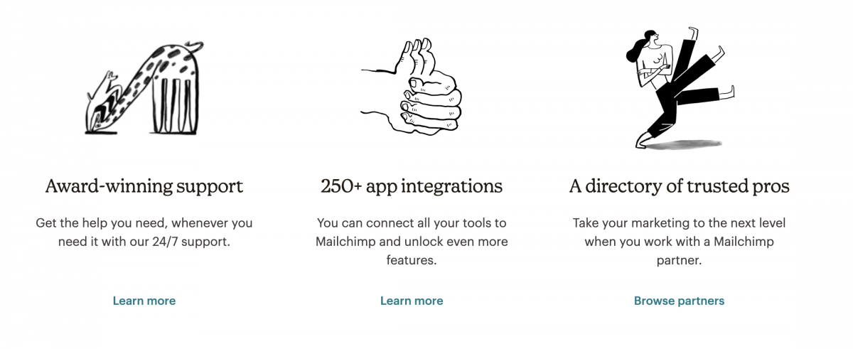
Illustrations – illustrations are a great way to make your website unique. A great addition to any website, it can convey your brand message and mission creatively. Playful illustrations are used frequently by SaaS companies like Hubspot and Mailchimp. A lot of organisations also like combining photos of people with illustrations to create a dynamic and personable site.
Photos – as the saying goes, a picture is worth a thousand words. Including images on your website can provide so many benefits. They can add context to your service/product, convey certain emotions, and better attract your target audience.
And did you know that including photos of people on your website can actually increase your conversion rate? Studies have shown that putting people on your site makes it more trustworthy. Individuals want to connect with others so no matter your organisations purpose, adding a human element will lead to higher conversions.
Hero Image
Your hero image is the first thing that people see when visiting your website, so it needs to be visually appealing and informative to keep them scrolling. Whether it’s an image, illustration, or video, it needs to represent your brand while also enticing visitors with a concise message.
Most hero sections contain a hero image, a title or message, and a call-to-action (CTA). Here are some standard rules to follow when creating your hero image:
Pick an image that represents your organisation – think about what drives your organisation and choose an image that accurately represents your brand. If you’re a theatre, you would pick imagery from your shows that feature actors in action. If you’re a non-profit, you would choose images that support your mission. Your imagery must be eye-catching because it will be a visitor’s first impression. If possible, avoid generic placeholder images and instead invest in your own images.
Avoid text on images – with responsive design, it becomes tricky to avoid your text shifting in an unappealing way. If you feature people in your hero image, you could end up with text covering someone’s face.
Avoid images that don’t leave room for cropping – make sure that the focal elements of your image are in the centre because when they are adapted to different screens the sides might get cropped. This happens often with group shots where without correct formatting, people will get cut off.
Choose high-quality images – to ensure that your image remains crisp and sharp at all sizes, make sure that you upload high-definition images.
Mute videos by default – if you want to include a video make sure that it’s muted when visitors enter your page. It’s bad practice to have your videos autoplay with sound.
2. Navigation Standards
Navigation standards are the elements of your site that users expect or are familiar with. It can be concepts like having a search bar in the header, a logo that brings users to the home page, or contact information in the footer. There are certain actions that users have grown accustomed to and changing them could negatively affect their site experience.
Some of these standards your users may not necessarily be conscious of – such as whitespace or reaction times – while others – like the aforementioned search bar – are more obvious.
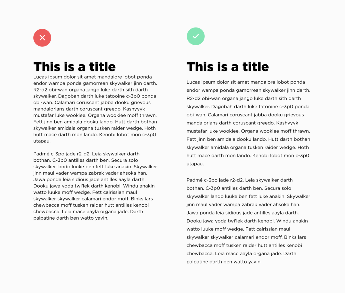
Whitespace
Whitespace is defined as the negative space between elements on a screen. Your text must be readable while also establishing priorities.
When your content is too close together users might miss important information or they might get overwhelmed. When your line spacing isn’t large enough your text becomes harder to read causing users to get frustrated.
Whitespace also helps users group elements together. They can then decipher which information to focus on and what’s considered secondary information. It can also lead to more conversion on your website because whitespace can be used to highlight your call-to-action.
Content Strategy
A content strategy is the planning, development and distribution of your site’s content. One of the most important aspects of a user’s experience is the information they receive, so it’s important to have a structured plan in place.
A common practice for modern web design is using a content-first design approach. Stemming from responsive web design, content-first uses your content strategy to guide the layout and design of your site rather than the other way around. Without properly planning your content, you could be missing important context that affects your user journey.
RELATED: 5 Elements of Responsive Web Design
Your content strategy is developed by creating a content priority guide, which is a guide that lists all the content that will be on your website. And I mean everything from buttons to terms & conditions. Your content is organised by level of importance specifically for a mobile screen. This is done without any layout specifications. The level of priority is determined by user needs and goals.
The benefits of using this method for your content strategy are clearly defined website goals and a better understanding of your users.
Menu Navigation
Your menu navigation is the first place visitors will look to find valuable information about your company and services. This is why your menu must be simple and predictable. Your menu isn’t the place to show off your creativity. You want your users to find information quickly so they stay on your website longer.
When it comes to navigating a menu, users have certain expectations built over years of visiting hundreds of websites.
Some standard practices across all menus are:
Logo on the left side – this has become such a standard practice that users also rely only on the logo to go back to the home page.
Search bar on the right side – not every single site requires a search bar, however, if needed it’s almost always on the right side.
Indication of current landing page – users should always know what page they are viewing which can be done by highlighting the menu item.
Interactive menu links – menu links should be clearly clickable by making the text change as you hover over them.
Another perspective to consider when redesigning a website are users on a mobile device. A standard for menus on mobile is the hamburger menu. It’s an icon used to represent a vertical menu that is suitable for any mobile device. It’s perfect because you can click on it to view or close the menu, saving precious space when navigating on a small screen.
Other mobile considerations include a “sticky” menu that follows users as they scroll down a page so they avoid having to scroll all the way to the top to access another page. An alternative is the “return to top” arrow icon which accomplishes the same thing.
3. Coding Standards
We’ve covered design and user experience, but another huge part of web design is all the work that happens behind the scenes. Frontend and backend developers follow a set of standards and guidelines created by the World Wide Web Consortium (W3C) to build rich interactive websites that perform on all devices. Some of these standards include:
Responsive Design
Responsive design, created around 2010, is what enables developers to create applications and websites that can be viewed on any device from mobile to desktop. Now websites are even adaptable to screens inside cars!
Before responsive design was invented, designers and developers would create mobile subdomains, essentially separate applications created specifically for mobile devices. This method worked well because these subdomains would load faster and use less data. But over time, with the ever-increasing number of devices, it became more and more of a hassle.
Now with individuals using everything from their watch to their refrigerator to access the web, responsive design is the best approach to provide a quality experience regardless of the device.
Not only that, there are additional benefits to responsive design including:
Increased conversions rates – 57% of users say they won’t recommend a business that has a poorly designed website on mobile devices. This just goes to show that having a site that looks good no matter the device is crucial to converting your users. The more engaging and well-designed your website is on mobile, the more likely your users will stay on your page.
Decreased development cost & time – since a responsive website’s code is adapted to a multitude of devices, it requires less time from developers compared to the traditional approach. It is also easier for site administrators since they don’t have to worry about how content will be displayed on mobile.
Improved SEO – responsive design by nature will increase a page’s loading speed, lower bounce rates, and improve site usability, which altogether will lead to better page ranking on search engines.
Accessibility
Site accessibility has become a standard in web design because of the importance of accessible information. Every individual has the right to information regardless of their disability, location, or hardware. In fact, the more accessible your site is, the better its overall user experience.
The W3C started a Web Accessibility Initiative (WAI) that brings together industry professionals, disability organisations, governments, and research labs that build the Web Content Accessible Guidelines (WCAG). These guidelines, which are constantly being updated, help individuals use the web to their full potential. It provides standards for every part of the web design process from the creative design to backend requirements.
If you’d like to learn more about web accessibility and how you can create a more accessible website, read our blog post outlining 12 tips for publishing inclusive content.
Security
Another important set of standards that organisations need to consider is the security of their website. Cybersecurity is becoming a bigger industry as companies try to maximise their online security and protect their data. Not surprisingly, the industry is expected to grow by 10.9% by 2028.
Taking website security seriously isn’t reserved for large corporations, cyber-attacks can happen to companies large and small! That’s why you should stay up to date on all the current security precautions.
To learn more about how you can protect your website, read this blog post about Security Measures for Your Website.
Final Thoughts
A successful website redesign encapsulates so much more than visual appeal. Good design is also about how a user navigates your website and how well it performs. With branding, navigating, and coding standards in mind, you will be able to build a website that you’re proud of.
It’s important to note that the practices that we outline in this post are a non-comprehensive list that serves as an introduction to web design thinking. Based on your company goals and target market, some of these practices might not be suitable for your organisation, and that’s okay! These practices can be adapted and modified depending on your needs.
Responsive design started making waves around 2010 when Ethan Marcotte published his first blog post on the topic called Responsive Web Design. Since then, it has become a foundational practice for web designers. Although a standard practice that’s over a decade old, responsive design continues to evolve.
This is our way forward. Rather than tailoring disconnected designs to each of an ever-increasing number of web devices, we can treat them as facets of the same experience.
Ethan Marcotte, via A List Apart
Responsive design is what allows developers to create an equal user experience regardless of the device being used. Instead of creating completely different websites for each device, the site is developed to adapt automatically to a user’s screen, allowing us to keep up with the ever-increasing number of devices.
What is Responsive Design?
Simply put, responsive design is a flexible way for a design layout to adapt to different device sizes and types. Not only are screen sizes different, so is the overall experience. On a desktop, you could be using a mouse, with a laptop a trackpad, and on mobile your touchscreen. A web designer’s goal is to ensure a comparable experience across all devices.
What does that look like? Well, there are a ton of different elements that go into responsive design. It’s a menu header turning into an expandable menu. It looks like four columns turning into one. It could also be side columns disappearing on smaller screens. All of these lead to an equally suitable experience across mobile and desktop.
Mobile-First Design
A big component of a successful website is using mobile-first design, also known as content-first design. Mobile-first ties into responsive design because the content you provide users needs to make sense on mobile and desktop. Since mobile has less space to work with, creating content for the smaller device first forces you to focus on the most crucial information. The alternative would be trying to squeeze the content you created for a desktop into a smaller screen. Not fun, nor fit for purpose.
When you’re mapping out content you need to think about the screen’s real estate and content’s levels of priority. When a user opens your homepage what information are they looking for? If you’re a theatre, they might be looking for tickets to your latest show. If you’re selling software, your user might be looking for a free trial. Each organization will have a different priority list.
Responsive Design and Accessibility
Accessibility is an important part of responsive design because individuals don’t experience the web in the same way. Designers and developers make web pages adaptable so that everyone looking at their screen can experience it in the most suitable way possible. Whether that’s through the optimization of code and assets for those without access to hi-speed internet, or through assistive technology markup data for the visually impaired, or those who simply prefer to navigate using their keyboard.
RELATED: Web Accessibility: 12 Tips for Publishing Inclusive Content
And everyone benefits from accessibility. When the sun causes glare on your screen, when you want to listen to videos without sound, or when you want to send voice messages. These are all examples of accessible design.
Most of the time, creating adaptable websites means thinking of functionality before aesthetics. Animations are cool, but will they work on mobile where hover states aren’t a thing? Will they hinder certain individuals from getting the information they need? These are all the things you need to ask yourself when thinking of responsive, accessible design.
5 Great Examples of Responsive Web Design
1. Content-First Approach
Remember that content-first = mobile-first. This is the most important element of responsive design. With its limited data and screen real estate, mobile naturally demands rigorous prioritization. The benefit of this approach is that you’ll end up with a design that responds to your users’ needs. Mobile-first isn’t always about eliminating information, it’s about setting priorities.
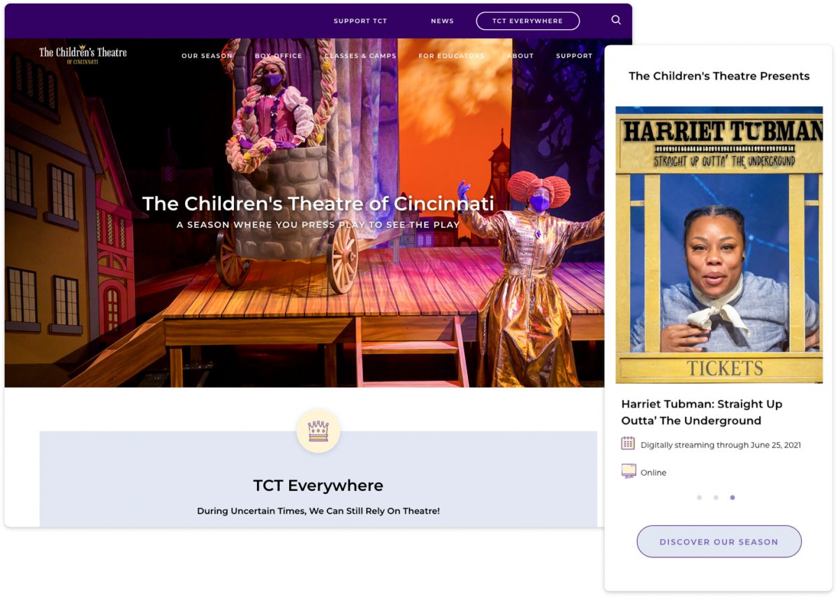
The Children’s Theatre of Cincinnati (TCT)
Using the content-first approach, TCT knows that its core audience is primarily looking for upcoming events and activities. As with many theatre-based companies, they’ve had to adapt to changing demands during a pandemic. Their homepage begins with an announcement of their commitment to continue entertaining audiences through remote videos and activities, followed by a list of streaming events. Instead of simply being stacked, the events on mobile are displayed in a horizontally scrolling carousel, allowing interested visitors to stop and browse. This also reduces the amount of scrolling for secondary audiences, such as donors and educators.
Their next level priorities are:
- Activities (on pause during the pandemic, but useful info for parents preparing for the end of lockdowns);
- Stats that speak to potential donors and educators; and
- News & Sponsors
By using a content-first approach, TCT has a website that speaks directly to its users no matter the device being used.
2. Progressive Enhancements
A content-first approach is the foundation to progressive enhancement. Once you’ve ensured that you have captured and prioritized all essential elements, you can enhance the experience for situations that can handle it, while resting assured that all your users will be able to find what they need. Very closely related to accessibility, progressive enhancement focuses on the content because some individuals won’t see the aesthetic design elements or interactive interfaces on mobile or older browsers. Content is what everyone wants to and can see, which is why it should be the foundation you build from.
RELATED: Understanding Progressive Enhancement
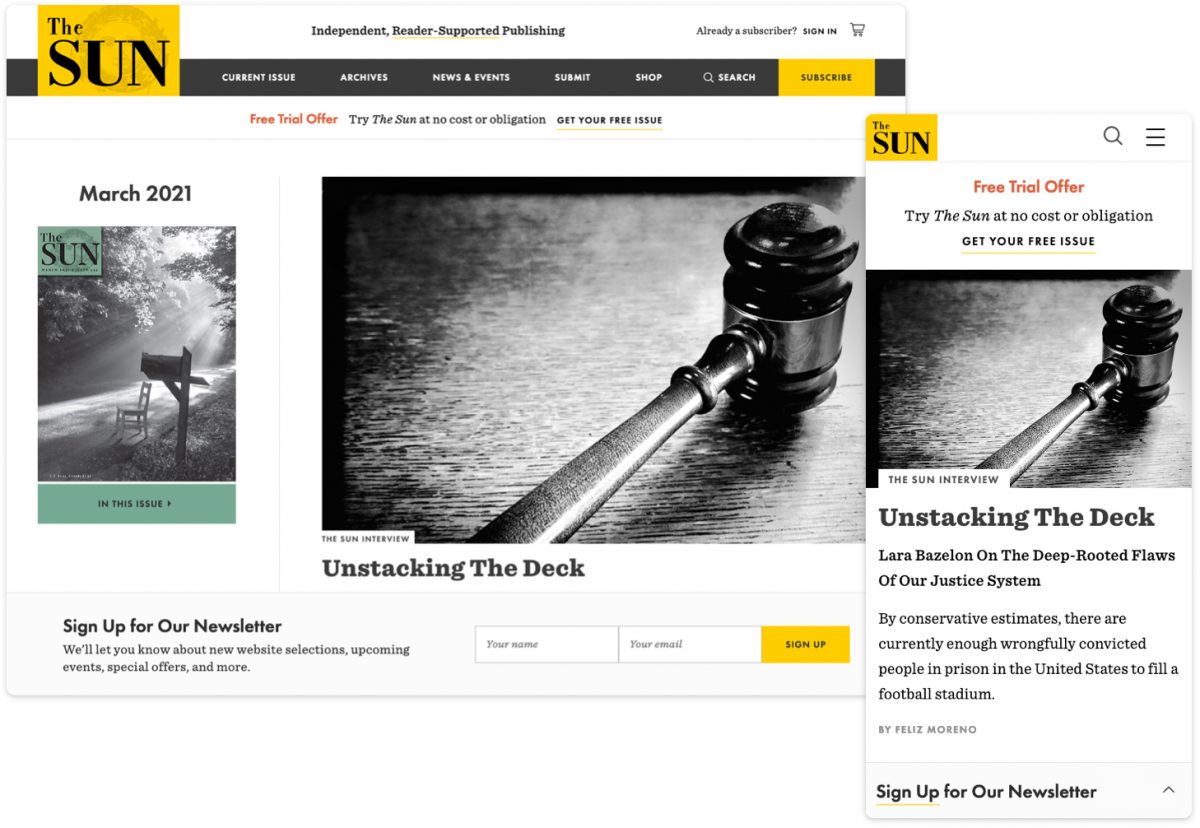
The Sun Magazine
To promote their newsletter, The Sun website features a sticky bar at the bottom of the screen to avoid interrupting the reading experience. The call-to-action comprises 2 states — a collapsed state which takes up minimal space, and an expanded state which reveals the sign-up form. On mobile, the collapsed state is preferred as this stays out of the way of the content. The larger screen size on desktop allows us to present the form upfront without overwhelming the page’s contents.
Similarly, mobile navigation is designed for that purpose — straightforward and always available, allowing the user to easily find what they’re looking for. The desktop navigation makes way for a megamenu experience — a type of expandable menu that lets you design an array of layouts to create an eye-catching table of contents.
3. Mobile Navigation
Responsive menus are navigation menus that are altered on different devices. It can change in multiple ways such as appearing in a different location, having different styling or different content. The user experience is very different on mobile, for example, the buttons are larger since they are tapped on instead of clicked on with a cursor.
The hamburger menu is a staple of mobile navigation. It’s the icon made up of three horizontal lines that you find at the top of mobile sites. It kind of looks like a hamburger — hence the name — and reflects the nature of the mobile menu, stacked to adapt to its smaller vertical screen. It’s a great way to get the navigation out of the way when it’s not needed and have it readily available when it is.
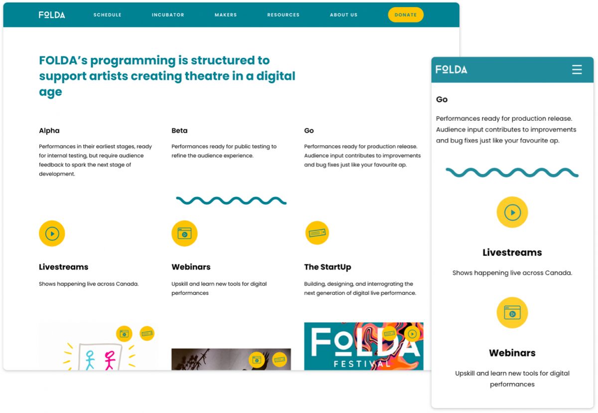
FOLDA
Another example of mobile navigation is a fixed header also called sticky navigation, which is featured on The FOLDA website. When screen real estate is really at a premium, headers can be designed to move off-screen when a user is scrolling down and actively engaging with the content, and then slide back into view when they scroll back up. Having the menu always accessible makes the user feel in control and leads to fewer page exits. Even though scrolling back up only takes a few seconds, not having the menu readily available can be a barrier for your users.
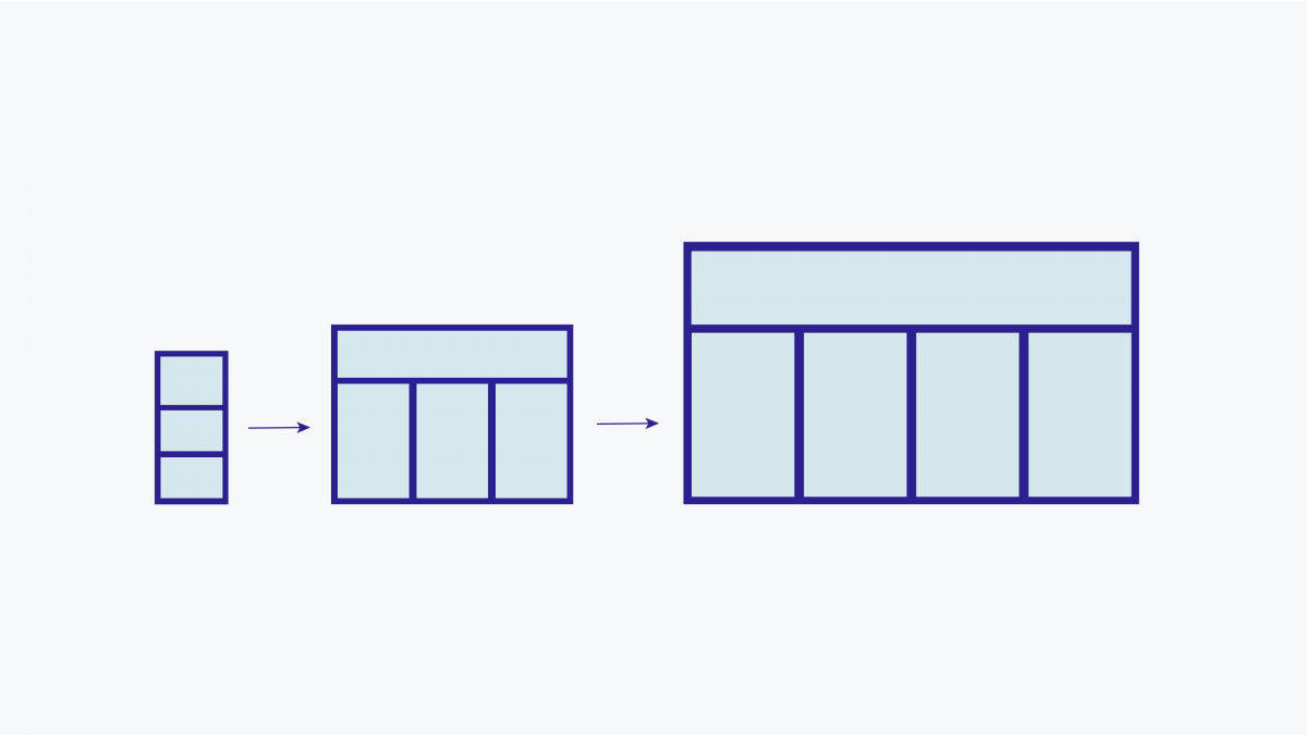
4. Fluid Grids
Fluid grids are another key element of responsive design. They allow your content to resize, stack, and flow to accommodate a wide array of screen sizes. Again, the content-first approach is essential to understanding how your content should be structured and prioritized at all sizes.
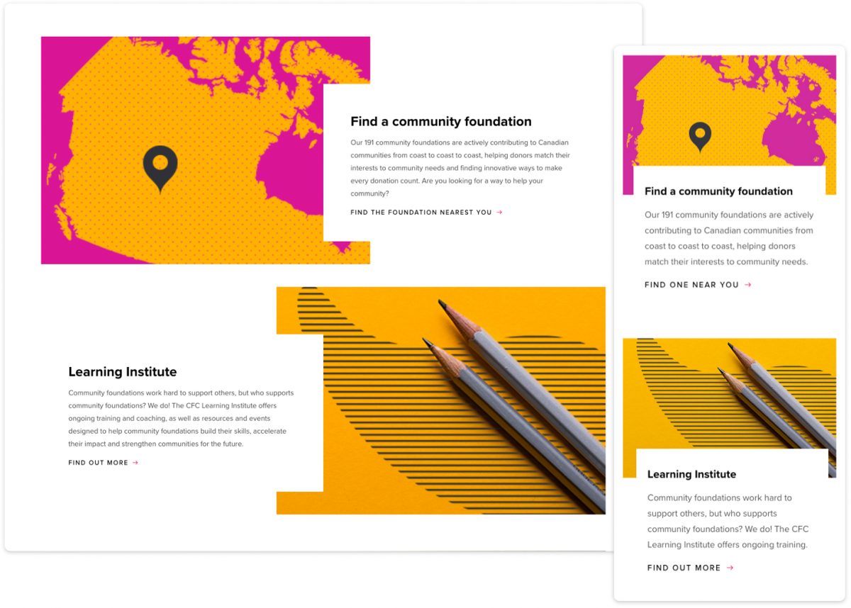
The Community Foundations of Canada
For the CFC website, we capitalized on-screen space to enhance the desktop experience with a dynamic, alternating layout and beautifully balanced use of whitespace. As the screen size begins to shrink, so do the columns. On mobile devices, the content gets stacked but maintains its order of priority. The dynamic white blocks are maintained to create a consistent look and feel across all devices.
5. Flexible Visuals
With flexible visuals, your images resize automatically to fit the screen. Flexible visuals allow designers to control how an image is displayed on horizontal desktop screens versus vertical mobile screens. And since images get scaled down on smaller screens, they can be optimized to load faster and still look sharp.
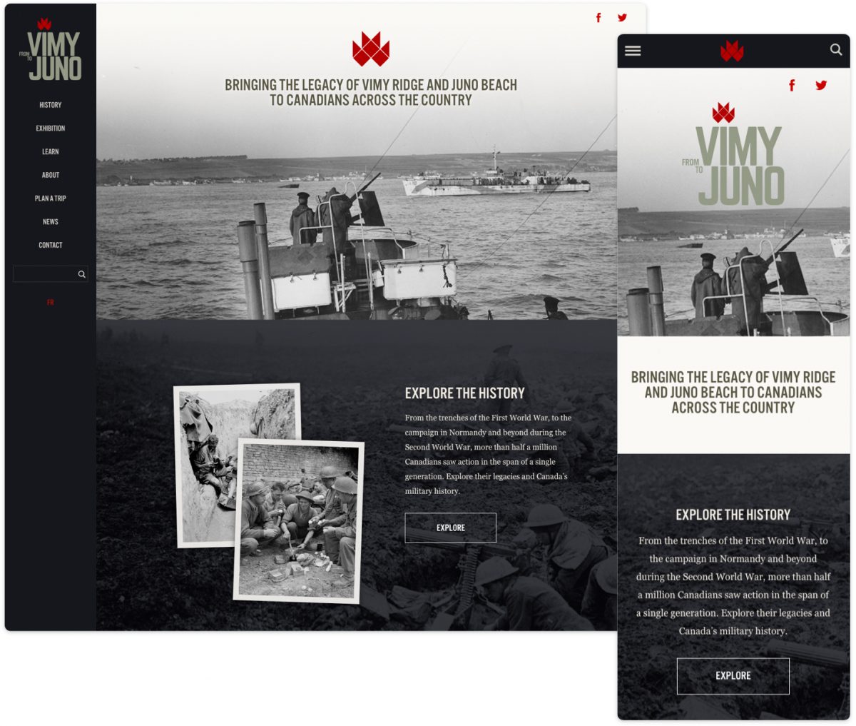
From Vimy to Juno
From Vimy to Juno is a great example of flexible visuals. Whether you’re on mobile or desktop, the images will resize to fit the device being used. Flexible visuals are now common practice for developers, but when talking about responsive design, it’s a necessary point to mention.
We announced earlier this month our sponsorship of the Digital Boot Camp for the Arts and now we are happy to share our guest post for Capacity Interactive’s blog written by Warren. Being that 2020 has been quite the year to pivot we wanted to highlight UI/UX insights. Here’s an excerpt:
It’s important to consider what changes you can make to your website to get you through this time of upheaval and connect better with your audience and patrons than you had before. To help guide you through how to use your website as effectively as possible with the tools that you currently have in place, I want to offer four tips to improve your websites’ user experience in the face of the current crisis.
Read the full article at Capacity Interactive.
“Can you reduce the white space so that everything is above the fold?” If you are a designer, this kind of request probably sounds like nails on a chalkboard. Whitespace or “negative space” in web design has two camps – designers who swear by it, and the rest of the world who want to fill the space with as much information as possible. Whitespace is often seen as wasted real estate space, but on the contrary, whitespace is one of the most valuable assets on your website.
What is Whitespace?
First let’s define “whitespace”. When talking about whitespace, designers are referring to the negative space between the elements on the screen. Whitespace isn’t necessarily white, it can be a colour or a texture.
“Whitespace is like the supporting cast, whose duty it is to make the stars of the show stand out, by not standing out so much themselves.”
Canvas Flip
There are two types of whitespace, macro whitespace which is the space between larger layout elements, and micro whitespace which is the space between smaller elements like words and letters or images and captions.
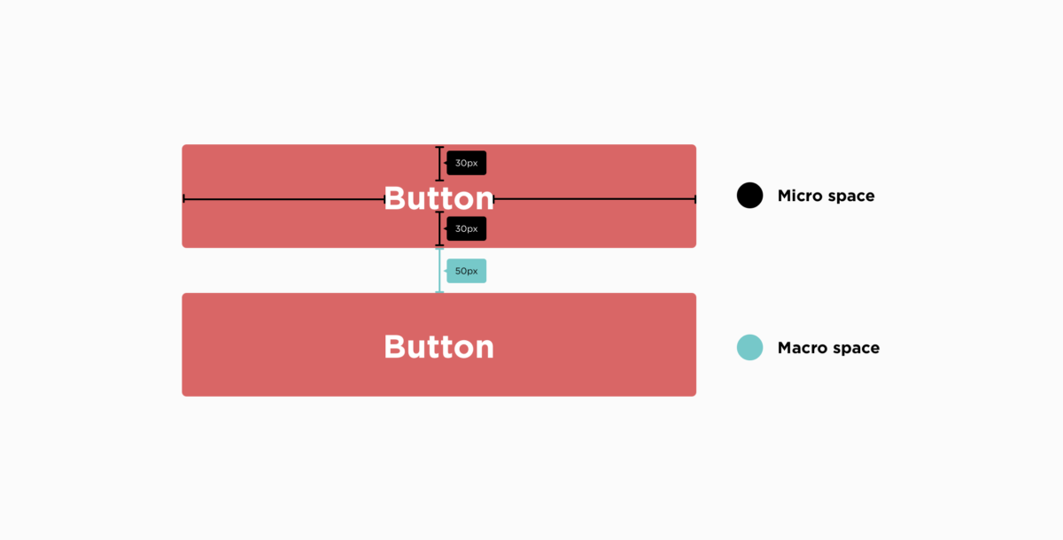
Readability and Priorities
Your content is the reason users are visiting your site. That’s why it’s so important to think about the site’s readability. It’s something whitespace can greatly improve. Something as simple as line spacing (the space between each line of a paragraph) can have a huge impact.
Enhance Usability and Content
In simple terms, having whitespace means your content is better highlighted. A cluttered page is not a pleasant experience for users, it’s overwhelming and uninviting. Studies have shown that the attention span of an Internet user is 6 seconds (that’s less than a goldfish, let that sink in…). Using whitespace helps users scan content, and quickly find the information they are looking for. Cluttering up a website with as much information as possible could ultimately discourage users from visiting a site again.
Elegant Design and Branding Positioning (a bonus)
Whitespace can also help elevate an elegant and sophisticated design. Consider the Apple website, they use an enormous amount of whitespace, and their products always shine. It makes you want to buy that brand new iPhone.
Whitespace isn’t a waste of space, on the contrary, it is a valuable design tool that used effectively can have an enormous impact on how your content is seen and consumed. Whitespace is your friend, embrace it.
We come across it every day on our laptops, phones and desktops. In the books we read, the magazines we flip through, the billboards we glance up at. Typography. And using it correctly is an art.
Making something as readable and appealing as possible involves myriad choices: from the perfect font, its size, decisions about line lengths and spacing. At Plank, our designers use typography on a daily basis, making sure each site we craft is perfectly suited to the subject, and a pleasure for users.
If typography is done well, all you notice is how effortless it is to browse. It’s the unsung hero of every website. With that in mind, here are some fonts we love, why we love them, from the people who use them most.
Jennifer Lamb, Creative Director
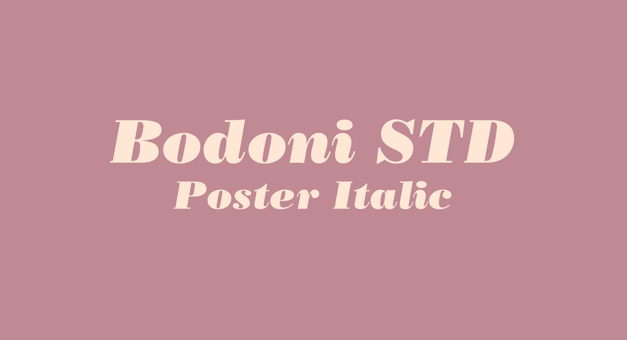
Bodoni STD Poster Italic
My ultimate favourite typeface is not in my top spot for its versatility. Bodoni STD is purely an aesthetic favourite. The lowercase italic f’s are a pure delight!
Balto
I’m also really digging Balto, a Humanist Sans typeface, aka “The American Gothic for the 21st century.” I look forward to working with it, often, and for a long time to come.
Sidenote: Check out the Arrows section of the Balto family page. It’s a whole lot of fun.
Avenir Next
Avenir Next is a beautiful Geometric Sans with a Humanist vibe and a wide array of variants. It looks great on screen and is one of the most readable typefaces I’ve ever come across at small sizes, which explains why LG adopted it for the buttons on its cell phone.
Steve Bissonnette, Managing Partner
Mrs Eaves
My top font pick is a non-standard one. The way the “zy” in the italic fits together alone makes me smile. It’s got a classic, easy to read feel and diverse family. The small caps are sublime — especially the Q. Let’s not even get started on the ligatures.
Véronique Pelletier, Interactive Designer
Apercu
Apercu is a grotesque sans-serif font that was released in 2010. I like it because it’s versatile, comes in a variety of weights and styles. I also like it because it’s quirky, it has a fun playful side to it that other sans-serif fonts don’t have.
Christina Garofalo, Backend Developer
Roboto
I love this typeface for body text, in both print and web. I like Roboto because it is open source, has Helvetica vibes without being Helvetica. It’s clean, easy to read, and has a full range of weights for variation. For a simple font, it’s fun to design with.
Added bonus: My favorite font site is Font Squirrel. It’s free for commercial use!
Megan McEwan, Front-end Developer
Futura
Sans-serif typefaces often feel modern and are generally considered well suited for the web. As someone who loves modernity and spends a lot of time looking at screens, I almost always prefer them to serif typefaces. Futura is a particularly special one in my mind. Released in 1927 and featuring clean, geometric lines, it is both classic and modern at the same time. Simple yet full of personality, it has a way of feeling retro-futuristic which is a design aesthetic that I find endlessly intriguing.
Massimo Triassi, Backend Developer
Lemon Milk
Lemon Milk is my favourite for a number of reasons; firstly it’s really angular and sharp, giving it a futuristic look. Secondly, it’s the first font I used as a brand font for the Robotics competition run by CRC Robotics, so in that regard it holds some sentimental value to me. Lastly, it helps that it’s free to use for non-profit purposes.
If your team is anything like ours, they’re always looking into ways of improving their workflow and making life easier. Our design team made the switch to Sketch just over a year ago, and we can safely say that whenever we’re asked to design in Photoshop, our hearts break a little. Don’t get us wrong, Photoshop is great for its intended purposes, but Sketch is just so much better for web design.
Get to know Sketch
Sketch was first released in late 2010 by Bohemian Coding. It’s a Mac-only design tool that uses a fully vector-based workflow—it’s basically responsive heaven. The learning process for Sketch is pretty short. If you are familiar with Illustrator and Photoshop, you will be comfortable with Sketch within a couple of days.
Perhaps the main reason why we love this app so much is because of its speed. Sketch was made for user experience design. The features available on Sketch are tailored to your goals, and you won’t get lost in all the extra features since they don’t exist. It might feel limiting at first, but that’s not a bad thing—having the necessary tools to get the job done is all you need. The shortcuts are very intuitive, and you soon forget the shortcuts you spent hours learning in Photoshop. Most features are available within a few keystrokes!
Vector based
We live in a world where responsive design can’t be ignored; it’s now a standard. Sketch offers built-in grid guidelines that do the job of calculating sizes for you. Layout settings allow you to customize your grids to your project needs and if the same grid is used often, it can be set as the default. Pretty neat!
The file sizes are also a major advantage of using Sketch. The files are much lighter than a Photoshop file, which allows us to view the entire user flow on one page, rather than creating multiple documents. The performance is smoother and less laggy than Photoshop. It gives us a better general overview of a project.
Resizing
This is where Sketch is powerful and a real time saver. Since it is a vector based app, all your objects are easily resizable and keep their properties. You can easily go from desktop to tablet, without losing your shapes’ properties. No more pixelated text when you zoom in or messed up rounded corners on rectangles. Everything stays sharp and crisp! They really improved the group resizing feature earlier last year, and we can safely say that this is probably one of their smartest updates.
Easy Peasy Exporting
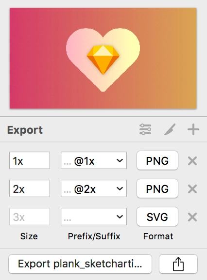
Exporting assets is a breeze. You simply need to click on the object you’d like to export, click on the “Export +” button, then set your export preferences. Whether you only need one version or multiple PNG versions and an SVG, you can set your preferences and export everything all at once. It is a major time saver as you don’t have to manually save each format one by one.
Layer and Text Styles
Creating text styles then applying them to your headings, body font, links, etc., is a walk in the park with Sketch. Imagine your client really disliking the font you picked and having to manually change everything? With text styles, in a simple click, you can change the font, and everything gets updated.
The same principle applies to layer styles too. It’s made to make your workflow faster and efficient. With layer styles, you set the colour fill, strokes, opacity, etc. Then you just apply those settings to any shape your heart desires. It keeps things consistent across the board and makes everybody happy!
Symbols & Overrides
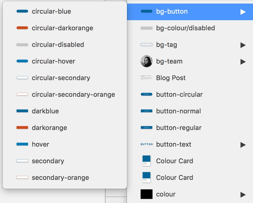
While symbols may seem to be similar to smart objects in Photoshop, they are so much more. Editing them is ridiculously easy once you master the art of nested symbols. You can quickly switch from a default to an active state in one click. While creating all states might seem time-consuming at first, trust us it will save you plenty of time in the long run.
Smart objects in Photoshop are great to create identical objects, but what happens when these objects need to have custom content? When creating symbols in Sketch, each element of the symbol becomes its own variable. This way, you can quickly change and update the content. It’s magic!
If by any chance your symbol has a unique feature that doesn’t apply to the rest of them, you can detach it from the symbol and make the necessary changes.
Libraries
Earlier this year, Sketch introduced Libraries to our workflow, and it is a game changer. While libraries are available with the Adobe Suite, adding this feature to Sketch just made working in teams on a project that much more efficient. Whether multiple people are working on a project or if you’re the only designer on it, having Libraries really simplifies your workflow. Libraries, much like Photoshop’s, are a master with all the elements that can be found throughout your project in one place. Need to make a quick change to the footer? You just need to edit it in the master and apply the changes to your design in one click. It also gives you the option of refusing the update, which is excellent.
CSS Things
The beauty of Sketch is that it is really developer-friendly. They can simply open up your Sketch file, copy the CSS attributes and voilà your website is done! Alright, it’s a little bit more complicated than that, but if you want to make sure that the final design matches what you’ve spent hours working on, the ability to copy CSS attributes for your development team is a major bonus. It’s also super useful for that gradient you love but that your developer can’t reproduce!
Honourable mentions
Colour management is made super easy in Sketch. Colour picking as well. By pressing control C, you can eyedrop any colour, not only on your Sketch file but everywhere! Measuring tools are also a gift. By simply pressing on the option key, you can see the precise distance between two objects or an object and the artboard. We love this; it makes us perfectionists happy.
The Plug-in possibilities are endless
If there’s a feature you wish Sketch had, chances are there is a plug-in out there to fix your problem.
Anima Toolkit – We recently really got into Anima, and we’re slowly exploring all the possibilities it has to offer. It has three main features: Timeline, Launchpad, and Auto Layout. Timeline allows you to create animations within your Sketch file. It’s handy to show your development team the kind of animations and transitions you are looking for. Launchpad lets you save your Sketch file to HTML (sidenote: it’s a paid feature). Auto layout, as the name suggests, helps with responsive layouts and
keeping things consistent.
Zeplin – One of our colleagues only works on Windows, which could have been problematic since Sketch is a Mac-only app. Thankfully, Zeplin came to the rescue and made it easy for us to share our files with her. It creates a Style Guide, which is fantastic since she can simply follow it to stay true to our design.
Craft – Craft is just great; it allows us to sync our design to InVision (another tool we’re really fond of!) quickly. No need to save every artboard manually and upload them. It gets the job done for you. It’s also great to populate your design with content rather than lorem ipsum. We find that this gives clients a better sense of the eventual outcome. Same for placeholder images, you can fill in your artboard with images directly from Unsplash or Getty.
Sketch has made our life much easier, and we don’t see ourselves going back to Photoshop. Not only is it considerably cheaper than Photoshop, it also allows us to stay organized, work faster and more efficiently. Technology is moving so fast, and prototyping tools keep getting better and better. We’re looking forward to seeing how Sketch develops over the next couple of months as the competition is real out there.
Trying to build a web product without a solid wireframe is like trying to build a house without blueprints. Having a solid set of wireframes helps keep our team on track as they build the website, but also reassures you, our client, that your project is going in the right direction. It’s also a major time saver in the long run. And who doesn’t like that? Time is money after all.
What is a wireframe, though?
Wireframes are the skeleton of your website. They consist of a simple layout, in black, white and grey, that outlines the placements of elements on the page. Wireframes are purposely left without colours, logos, and imagery to minimize distractions and focus on usability and function. They’re meant to be done quickly, without being too detailed.
Wireframing is the way to go
Usability and functionality
Perhaps the most important reason why wireframes are a must is to focus in on usability and functionality. By keeping wireframes simple, we avoid distractions like “that shade of blue doesn’t stand out enough, can we make it pop?” or “I don’t like this image, I’d like something with more cats!”. In the early stages of design, it’s more productive to focus on the underlying structure that will make the website a success. Wireframes allow us to discuss and work through all interactions between elements, to make sure the user experience is as optimal as it should be.
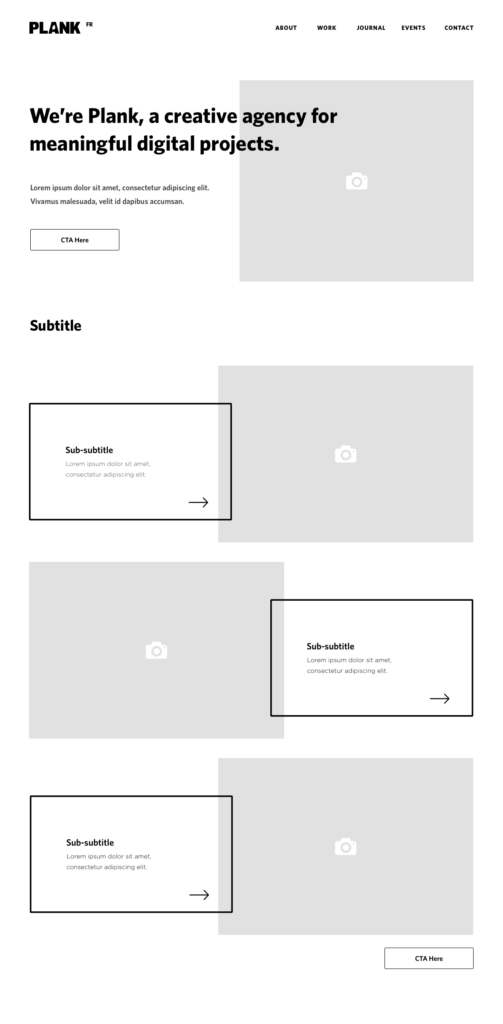
Wireframes are the perfect opportunity to validate designs and make sure the project is headed in the right direction. It is here that we establish which elements are the most important and where they should be placed on the page. By creating wireframes, we provide a visual reference to help you understand our thoughts and processes.
Wanted vs Needed
As a client, you’ll have a million ideas as to what you want your website to accomplish but, until put in context, it’s not always easy to assess which ideas work and which ones should be dropped. Wireframes help to set expectations from an early stage and avoid conflicts later on in the project. They help clarify what is essential to reach the goal of the website and what is a “nice to have” feature that can be left out.
Wireframing not only for desktop but for responsive also helps to prioritize features and visualize how the website will display across all platforms and devices to come up with the best way to adapt layout and content.
Wireframes are a time saver
While producing a full set of wireframes can take a couple of days to a few weeks, depending on the scale of the project, wireframing will end up saving time in the long run. Wireframing allows the designer to solely focus on making sure the site structure is solid so that the rest of their design process is more efficient. It is also much easier to make changes to low fidelity wireframes than it is to highly detailed designs.
Wireframes are not only helpful to our clients but our team as well. Keeping our development team in the loop from the start is the best way to avoid major changes and problems further along the way. They’ll be able to point out flaws and functionalities that might require an extra amount of work. With wireframes, we can all plan accordingly.
Are there cons to wireframing?
Wireframing is a reliable method of working that has been proven time and time again. The only downside is when the process is misunderstood — something I hope this article has cleared up. Wireframes are not final designs, they’re a planning tool to make the best decisions about user experience and functionality. That’s why we keep them as simple as possible.
Some clients would rather see the full design with colours and pictures from the very beginning, and see wireframing as an unnecessary extra step. I want to reassure you that wireframing will save precious time and money in the long run. There are great tools like Sketch and Adobe XD that make wireframing so easy that the time put into producing them is well worth it.
In the end, wireframing is an essential step in a well-planned project, and eliminates a lot of unwanted surprises down the road.
CSS Grid Layout is the most groundbreaking thing that has happened to CSS specs — in the past 2 years at least. I won’t do the whole genesis of how it came to be, others have done it already. Instead, let me tell you how the websites of Montreal’s high profile music festivals were the perfect use case for it.
The challenge
First, a little backstory. Last year, we developed a platform for our client evenko — producer and promoter of these festivals — that endowed them with greater content management capabilities along with implementing a clean and consistent UI on the front-end across all websites.
A greater level of control for the administrative users comes with the necessity that every UI container be highly modular. One of the things that kept us on our toes about that aspect is how these blocks were going to systematically arrange themselves. To put it simply, one feature — which we refer to as module — can be displayed in a container which in turn could have various widths. Here’s a sketch of the different containers we find on the websites:
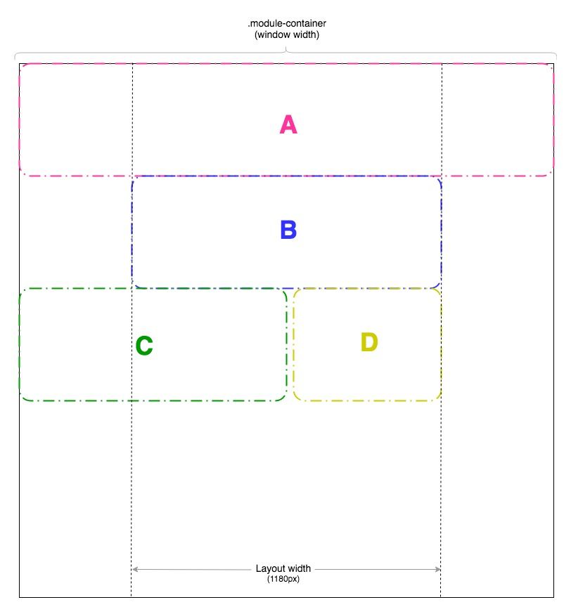
- ContainerA:
Spans the full width - Container B:
Spans the full width inside the layout wrapper - Container C:
Spans half the window width - Container D: Spans half the layout width
These blocks all stack up inside this one parent div (.module-container) and the order is entirely to admin’s discretion. With that in mind, some Flexbox fiddling had to be done to take into account every possible order — especially the half-widthblocks. For instance, combinations like:
- C – C
- D – D
- C – D
- D – C
- D – C – D
- C – C – C
- and so on…
are all problematic at first. In a normal set up, 2 half-width blocks sharing the same row is business as usual: just wrap ’em in a flex parent. But this is not possible here, remember? Admin has full control of what’s being thrown in the module container and we therefore cannot assume they’re going to group them 2 by 2 or have an even amount of half-width blocks.
CSS Grids to the rescue
This past winter, with the websites theme overhaul phase and with a now strong cross-browser support for CSS Grid Layout Module, it was time to let go of the way it was done last year — which was based on Flexbox and required lots of CSS classes and exceptions to cover ALMOST all scenarios.
The solution
#sass

$gutter: 20px

$layout-max-width: 1180px

$latGutter: calc((100% - #{$layout-max-width + 2 * $gutter}) / 2)

.module-container

    display: grid

    grid-template-columns: minmax(0, #{$latGutter}) repeat(2, 1fr) minmax(0, #{$latGutter})

    grid-column-gap: $gutter
There’s actually a bit more that goes with it, but it is essentially the backbone of the entire grid system. This bit of code deserves some explanation, so let’s break it down by superimposing it on top of our mocked layout (sorry in advance for all the arrows).
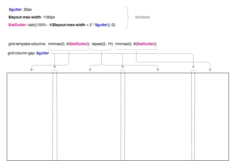
When creating a new modules, the admin user is given 2 parameters to select from to set its size:
Module size:
- Full width (default)
- Half width
Constrain module (is the above size relative to wrapper or window):
- Yes
- No (default)
The value of the parameters yields a specific CSS class.
#sass

.module-span-full

    grid-column: 1/-1

    &.module-constrain

        grid-column: 2/-2

.module-span-half

    grid-column-start: 1

    grid-column-end: span 2

    + &

        grid-column-start: -3

    &.module-constrain

        grid-column-end: span 1
Now for example, creating modules with size A, B, C, and D respectively, blocks will naturally stack up inside the module container as follows:
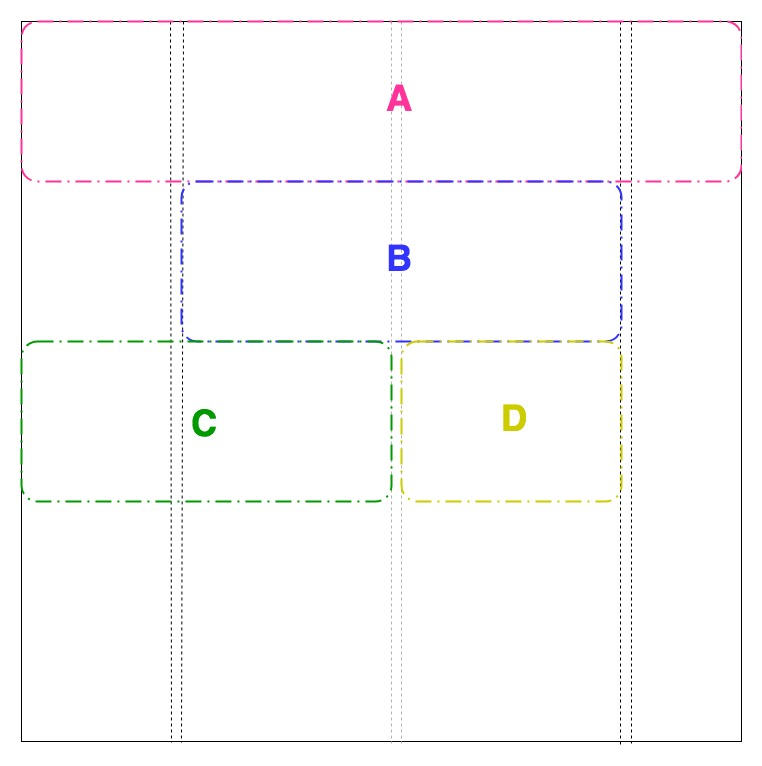
That’s the gist of it. Go see it live in action on Osheaga, IleSoniq, Heavy Montreal websites.